Release 1.5.22

This minor NarraFirma release fixes one tiny mistake: I forgot to save one file (package.json) with the new version number in the previous release. That’s all.

As always, if you find any bugs, please tell me on the GitHub issues page.
Release 1.5.21

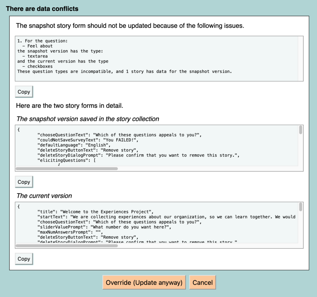
This minor NarraFirma release adds a new import option (for multi-choice data with intermingled write-in answers). It also improves help and guidance for data import and for changes to story forms that are connected to non-empty story collections.

As always, if you find any bugs, please tell me on the GitHub issues page.

Release 1.5.20

This minor NarraFirma release adds two things: more noticeable warnings when you have read-only access to a project; and a bit more information on the “spot-check graphs” page.

More noticeable read-only warnings

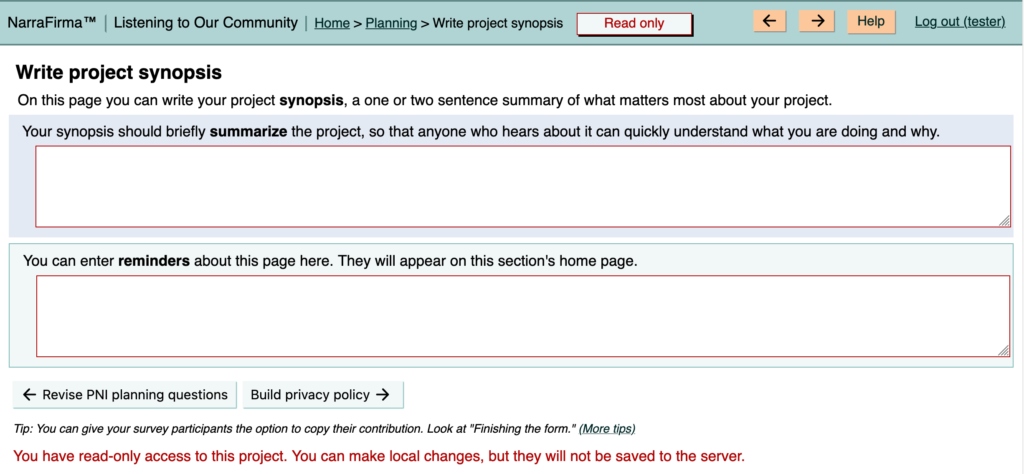
A helpful NF user told me that they sometimes forget to log in, type in some texts, and then lose their changes when they reload the page. To help people avoid this difficulty, I have made the situation in which you have read-only access to a project more obvious.

  1. The warning message that pops up when you first enter such a project (or reload a page) now displays for 8 seconds instead of 5, so you might be more likely to notice it.
  2. The read-only label at the top of the page, which was tucked away in the upper-right corner, is now front and center, in a box with a border. It should be harder to miss now.
  3. There is now a read-only text reminder at the bottom of each page as well.
  4. In read-only mode, each text box and drop-down list now has a red border.

screenshot showing read-only warnings

These graphical changes should make it more obvious that your edits are not being saved to the server.

Why can you edit a NF project locally in read-only mode? Because we thought people might want to make tentative local changes, save their altered project as a file, and use it to propose permanent changes to a team project.

Apparently nobody actually does this. So we could remove this functionality and make it impossible to edit anything at all when you are viewing a project in read-only mode. However, that’s not a change I want to make lightly, because it could break things. So if we change this, we will take the time to do it carefully. For now, these improved warnings should be enough to help.

More info while spot-checking graphs

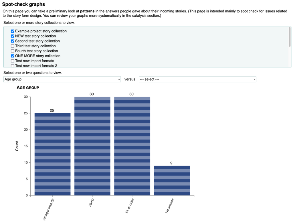
Another helpful tip (from the same user) was that the “spot-check graphs” page makes a sort-of-okay dashboard to use with participants in sensemaking. I had never thought of using it that way!

I have been thinking about adding a participant dashboard to NF for years, but have not yet got around to building one. If you have any ideas on what such a dashboard should do or look like, please send them to me (cfkurtz at cfkurtz dot com).

Anyway, while I was fixing the read-only issue, which seemed important enough to address right away (and I had a moment to spare between other things), I took another moment to enhance the spot-check graphs page a bit. Specifically:

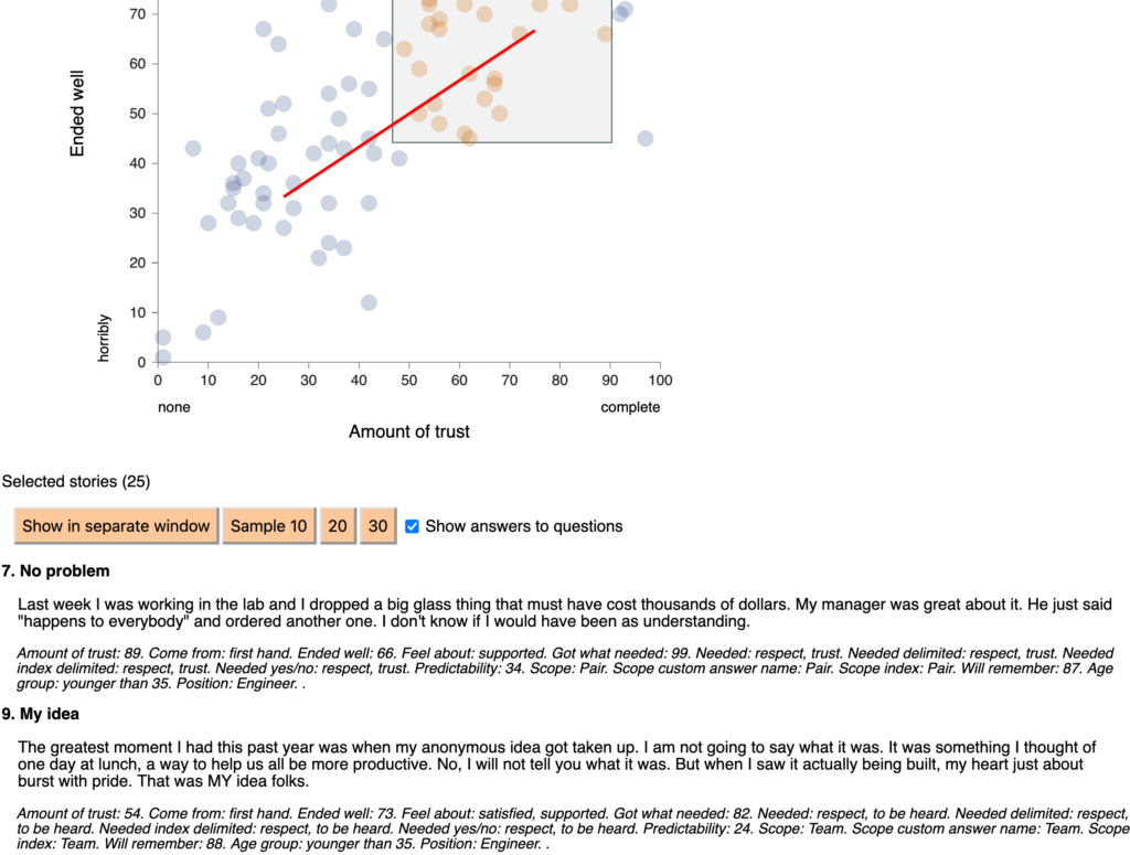
  • You can view the stories you have selected in a separate window for copying and pasting elsewhere. (You could of course copy and paste from the HTML page already, but this is a bit easier.)
  • You can view a random sample of 10, 20, or 30 of the selected stories. This is useful when your list of selected stories is long and you don’t want to choose a biased subset. (In a dashboard, you should also be able to filter stories by answers to an additional question.)
  • You can view a bare-bones description of the answers to questions about the selected stories. It’s not as nice a presentation as in the story cards, but it’s still useful, especially if you paste it into a word processor.


screenshot showing improved options

You might wonder why there is no copy-to-clipboard button in the “Show stories in separate window” window. It’s because the way you copy to the clipboard is different in different browsers and operating systems (and between WordPress and Node.js). Rather than try and fail to make a universal copy-to-clipboard button work, I decided to rely on the fact that everybody knows how to “select all” and “copy to clipboard” in whatever environment they use. I can do that so fast I don’t even notice I’ve done it, and probably you can too.

A big thank you to the user who proposed both of these changes! And as always, if you find any bugs, please tell me on the GitHub issues page.
Release 1.5.19

This minor NarraFirma release improves several aspects of completeness.

More note-taking

Some NF users love the note-taking aspects of the software. They like answering the questions and thinking about what they are doing as they move along. Other NF users are uninterested in that part of the software. That’s okay; those parts are easy to ignore. (I’m a big note-taker, myself.)

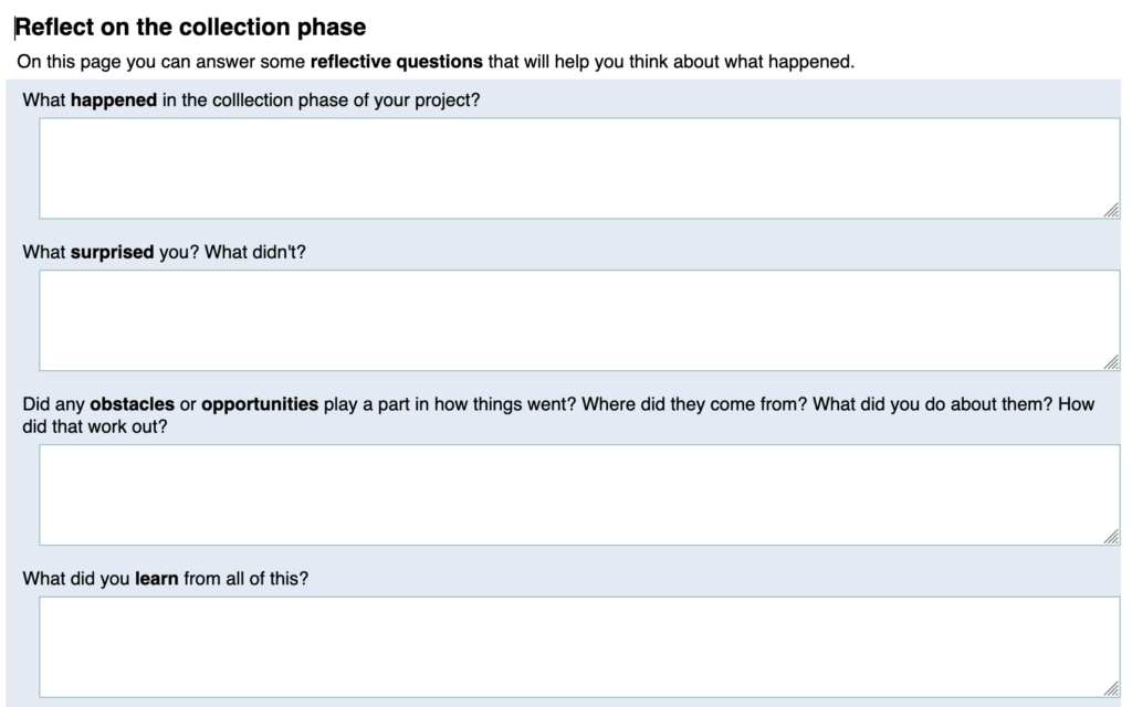
In looking over NF’s note-taking capabilities, I found and closed a few gaps between what you might want to remember about your PNI project and what NF asks you about it. Specifically, there are now “Reflect on” pages for each phase of PNI (Planning, Collection, Catalysis, Sensemaking, Intervention, and Return).

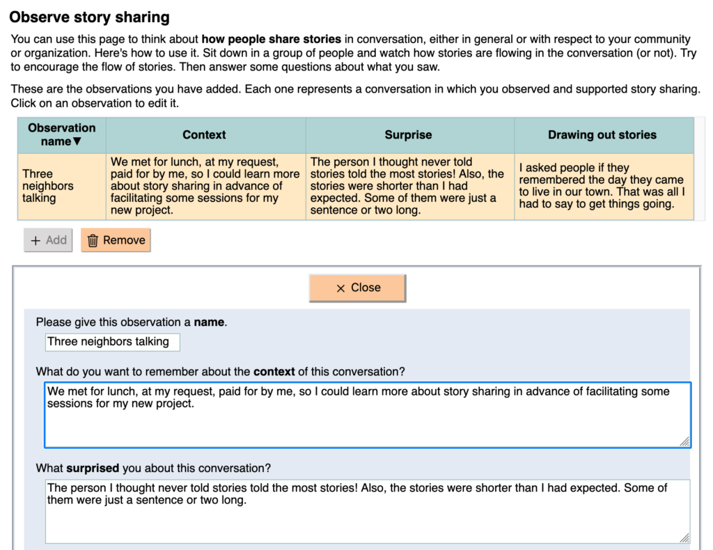
In the Planning phase, I added a page where you can watch people share stories, then reflect on the flow of stories in the conversation by answering some questions about it. You can use this page either to learn more about story sharing in general or to learn more about the unique style of story sharing in your own community or organization.

I also added a few more reflective questions to existing pages. For example, I renamed the “Project facts” page the “Describe your project” page (and added some more questions there). I also added some more questions about each participant group.

Privacy policy

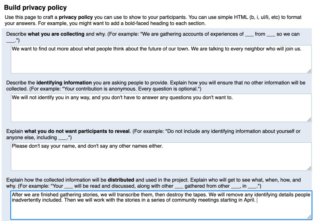
In writing the Planning pages of NF, I forgot to include a page to work out a privacy policy you can show to your participants. I’ve added that now. (I can’t believe I never noticed this before.)

Icons and tips

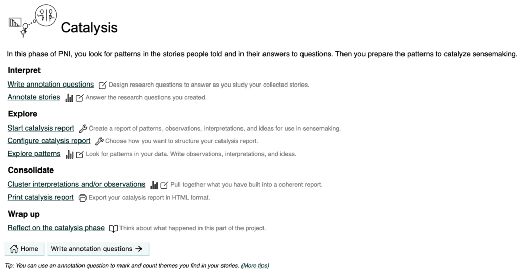
People tell me that NF has a steep learning curve, so I keep trying to pull it down. This time I’ve added little icons that tell you what types of activities are available on each page, in the categories of: manage (a wrench), plan (a light bulb), enter (a sort of pencil-in-a-box thing), review (a bar graph), journal (an empty notebook), or export (a teeny tiny printer).

I have also added a tip at the bottom of each page, with a link to all the tips (in the help system). These are essentially all the things people have told me they were confused by or got stuck on. There are about 80 tips so far. I’ll keep adding more as I go.

NarraFirma screenshot showing new icons

All of these extra help features can be turned off on the Project options page. You do have to turn them off in each project (there is no way to turn them off for your entire NF installation), but it’s quick. I think the new aids will be helpful enough to new users to be worth the hassle to the pros.

As always, if you find any bugs, please tell me on the GitHub issues page.
Release 1.5.18

This minor release makes a change to how you use NarraFirma that might be annoying for a while. But it’s a good thing.

NarraFirma has always had a capacity for data validation, meaning that it can check to make sure you haven’t put in the wrong data or left things out that were necessary. But we didn’t use NF’s validation system much. Usually people would figure out they were missing data in other ways, like that their survey didn’t work. But that’s a frustrating and painful way to find out that you are missing information!

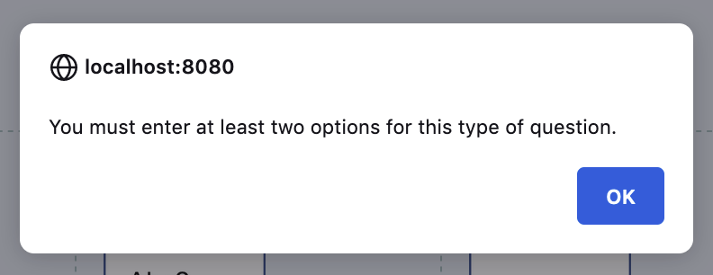
So, with this update, when you create or change a question, NF will check to see if the question has a short name and a type, and it won’t let you stop editing the question until you fix the problem. If it’s the kind of question that should have a list of answers (select, radiobuttons, or checkboxes), NF will also check to see that you did indeed enter a list of answers.

So what’s the annoying thing? It’s that the NF data validation system lives in the editing panel that appears when you click on a thing in a list. It’s that little window-in-the-window with the Close button at the top.

I don’t remember why the validation system lives in that panel. But it does, and that means validation can only happen within that panel. Years ago, when we first built the validation system, the only thing it did was to check that the story form you associated with a story collection existed. That is why there is a long scary warning about “Click the Close Button!” on the “Start story collection” page. But now there are three more types of validation, and it’s not a good thing to be able to thwart the validation system by simply clicking on a button located outside the editing panel.

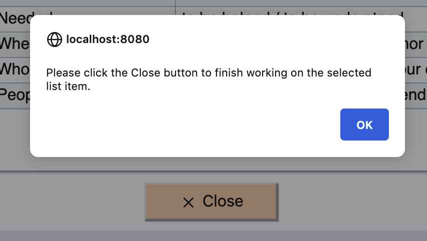
As a result, in this release I have changed how the page-change buttons work. If you have the editing panel open (showing anything that appears in a list), and you click on a page-change button, NF will ask you to close the panel before you change the page.

This will probably be annoying until you get used to it. However, it will help you avoid problems that arise when you forget to enter information NF needs to make your survey (and your project) work.

I also made two smaller changes:

  1. You can use simple HTML tags in your NF survey texts. Hence, when NF encounters a less-than angle bracket (<) it has always assumed that you were trying to embed an HTML tag, and it looked for a closing symbol (>). However, I noticed that when people are asking people about their age, they often want to use the < symbol numerically, as in “<20”. In this release I changed the code so that NF now prints a lone < symbol rather than stopping and complaining that your HTML is malformed. If you do intend to use an HTML tag and forget the closing bracket, you will have to fix it yourself; but that’s probably less likely (and less trouble) than getting stuck on a numerical symbol that won’t print.
  2. I’ve had a lot of email (or GitHub) exchanges in which I asked people to look in their browser’s development console and tell me what it said there, because when NF encounters an error that’s where it says what happened. It always takes people a while to figure out how to do that. So in this release, I added a global error handler that shows you a pop-up alert with the same error message as you can read in the console. Hopefully this will help people get help fixing problems sooner.

Many thanks to the helpful user who told me about the problems they had with missing data and the < symbol!

As always, if you find any bugs, please tell me on the GitHub issues page.
Release 1.5.16

This minor release is an anti-verbosity pro-clarity update. I looked around NF for “chartjunk” and annoying distractions and removed as many as I could. This is easiest to do when I haven’t used NF for a while and am able to get some distance from it. When I can look at it with fresh eyes, improvements don’t feel (as much) like picking at my own flesh.

Easier data editing

I finally got rid of the two-mode view-edit display system when you click on a thing (like a question or a story) in a table of similar things. Our original plan was that a two-step system would help people avoid accidentally ruining their data. We thought people should have to view each item, then click “Edit” to change it. But in truth, that extra step is just annoying. As I watched people use the list-of-things widget, I realized that it didn’t really help people protect their data. It just confused them for a while, and then they learned to skip over the view-only step.

So it is gone, man. I removed the “View” and “Edit” buttons. Everything is editable all of the time. Have at it.

Help remembering to give things names

Several items in NarraFirma require short names that identify them:

  • questions (eliciting, about stories, about participants, annotation)
  • story forms
  • story collections
  • catalysis reports

Some users have had problems because they created things without giving them short names. This caused problems in linking the things up to other things. NF no longer allows you to do this.

I have also tried to make it more clear that short names are required for some items, in words and in colors.

You can still create a no-name item if you stop editing the short-name field by going to another NF page (for example, by clicking one of the arrow buttons at the top of the page). However, if you stop editing the field by:

  • clicking the Close button
  • clicking on another item in the list
  • clicking one of the arrow navigation buttons under the list

NF will check to see if you set a short name and remind you if you didn’t. That should help. My suggestion is: don’t use the “next page” and “previous page” buttons at the top (or bottom) of the page unless you are done working on that page.

In retrospect, every item in NF should have had UUID linkups rather than short-name linkups. I could change this, carefully, in the future. I just don’t have the time to do it (carefully enough) right now.

I also changed the lists-of-things widget so that it only shows the previous and next arrows if you have 2 or more items in the list, and the start and end arrows if you have 6 or more items in the list. Useless buttons are annoying.

Better story-form editing

When you are creating a story form and rearranging your questions in it, it’s hard (and annoying) to remember what short name goes with what question text. Now it says the question text right there.

Button icons!

Finally, I went through NF and added an icon for every button. Button icons can be cluttery! And annoying! But if they are consistent, they can improve clarity and speed up comprehension, smoothing your workflow. Hopefully these new icons will be of the improving and speeding type, and not the annoying type.


There are a few places where I did not add button icons. These are places where there are several buttons in a set. Adding icons to each of those buttons would take up a lot of screen space. So I left those alone.

Otherwise, every button in NF now has an icon. (Well, except for a few “Close” buttons on pop-up dialogs.)

Little things

I also made some smaller clarity improvements:

  • I simplified the header at the top of every page.
  • I cleaned up the section pages (Planning, Collection, etc), removing every extraneous word I could find. I shortened the headings and the page-link explanations. Now the section pages should be more quickly skimmable.
  • In Planning, I moved the “Assess story sharing” page closer to other pages related to assessment.
  • In Collection, I renamed the “Design, generate, or import story forms” page to the simpler “Build story forms.”
  • I changed the Help link (at the top of the page) to a Help button so it’s harder to miss.
  • I removed the orange backgrounds from the section-page headers so they look calmer and less like buttons.
  • I changed the colors of the navigation buttons at the bottoms of the pages. I always felt like they distracted the eye from the content of the page. Now they are more parenthetical.
  • I fixed a bug in which activity lists in printed sessions (for story collection and sensemaking) were not in the correct order.

As always, if you find any bugs – or if anything about NF is unclear or annoys you! – please tell me on the GitHub issues page.
Release 1.5.15

This minor release deals more gracefully with a (reported) situation in which a multi-choice question (checkboxes) was changed to a single-choice question (select) after data was collected. NF was choking when the stories were being exported. In general it is best not to make changes to question types after stories have been collected. However, NF should now handle this particular situation more gracefully, by posting warnings to the development console (and exporting the data anyway) rather than refusing to work.

Thank you to the user who pointed this bug. As always, if you find any bugs, please report them on the GitHub issues page.

Release 1.5.14

This minor release fixes a bug in printing story cards where story-form question-answers were not appearing.

Thank you to the user who pointed this bug. As always, if you find any bugs, please report them on the GitHub issues page.

Release 1.5.13

This minor release fixes two tiny bugs you might have run into if you had extra (blank) leading or trailing spaces in your question short names, or if you had extra (empty) lines in your available-answers lists. NF now deals more elegantly with both situations.

Specifically:

  1. The choose-questions-for-story-form widget was not matching up questions correctly if your question short names had extra (leading or trailing) blank spaces. This might have caused questions to stay in the pool of unassigned questions (on the right) even after you assigned questions to your story form (on the left). Now any extra blank spaces are being trimmed off, fixing the mismatch.
  2. When the survey was displayed, any extra (empty) lines in choice-question available-answers lists were creating malformed survey HTML, causing the error “Something went wrong loading the survey questionnaire from the server.” Blank lines are now being trimmed out correctly. (I meant to trim them out before, but I accidentally used the wrong array function.)

A big thank you to a helpful user who pointed out both bugs. As always, if you find any bugs, please report them on the GitHub issues page.