This release includes many improvements, mainly to to the catalysis process. We would like to thank our supporters for the development commissions that funded this release. (Want to see what’s coming next for NarraFirma? Have a look at our new commissions page.)
New report type
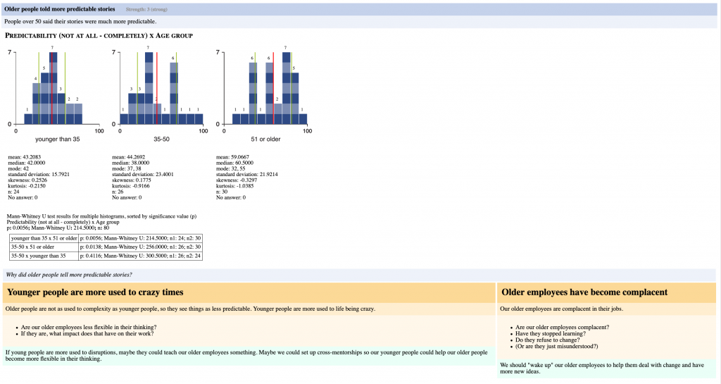
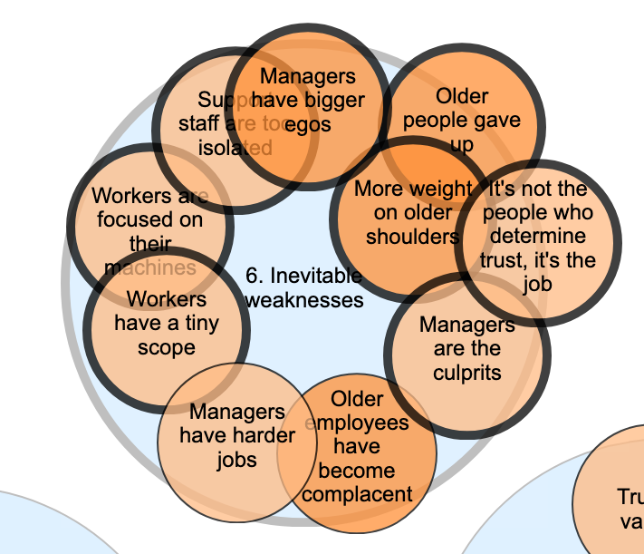
First, there is a new catalysis report type organized by themes, or clusters of observations. In this new type of report, interpretations follow observations instead of the other way around.
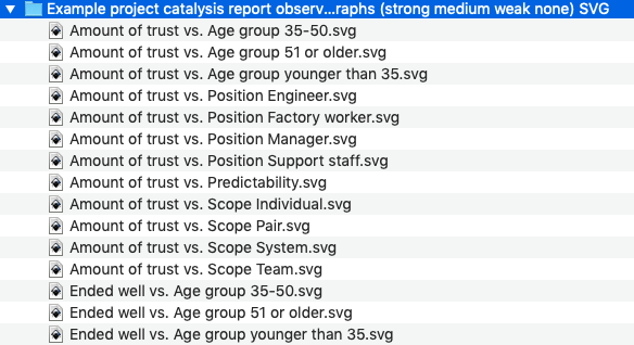
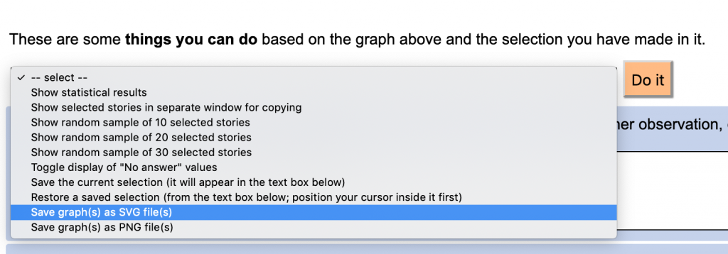
Also, you can now save a bundle of images associated with your observations in a ZIP file (in PNG or SVG format).
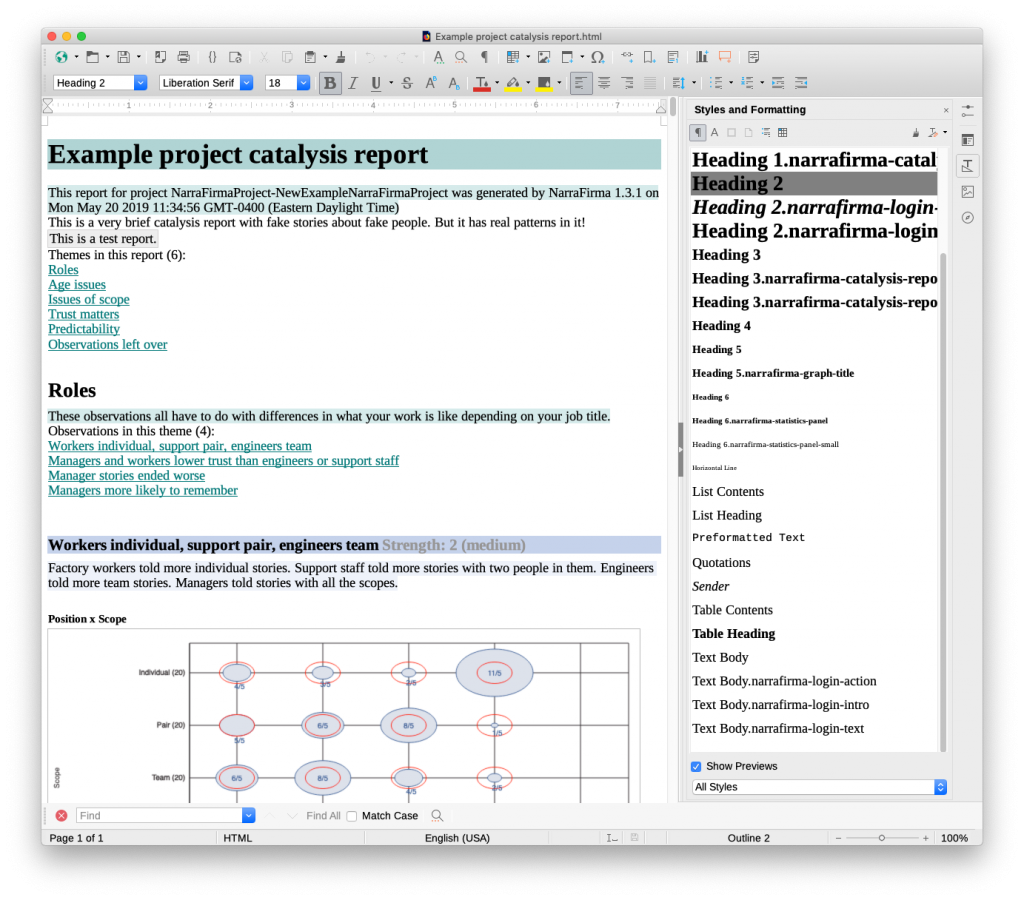
Also, all reports now use HTML headers (H1 to H6) to start the various sections of the report. These are more likely to be recognized by your word processor as styles. (LibreOffice picks up HTML headers pretty well.)
More flexibility in creating observations
You can now set up multiple observations per pattern. You could already do that using the @header@ sectioning system, but it was awkward and difficult. Now you can do the same thing using buttons in the interface. This also means you can cluster your observations separately even if they connect to the same pattern. You couldn’t do that before.
Please note that we have not included backward compatibility for the old @header@ sectioning system. We decided that leaving in all that messy code (not to mention adapting it to the new report types) was too risky. If you have any reports with observations that use the old @header@ system, please copy and paste your texts into new observations.

Also, it is now possible to include multiple patterns per observation. This is useful when you see the same thing happening across two or more patterns, and you don’t want to write what is essentially the same observation in two places. Now you can include a list of additional patterns (graphs) to display for any observation. This is also useful when you are showing a particularly confusing contingency (bubble) chart, because you can include the bar charts for each axis right there in the observation.
New report fields
Observations have a new linking question field, which you can use to connect the observation to its interpretations. This question will help you avoid restating the observation as you write each interpretation.
Interpretations have a new questions field, which you can use to pose questions to the people who are doing the sensemaking. This addition was suggested by a NarraFirma user who pointed out that because catalysis is supposed to generate more questions than answers, it would make sense to have a place to write the questions. (I should have thought of that a long time ago.)
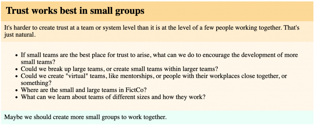
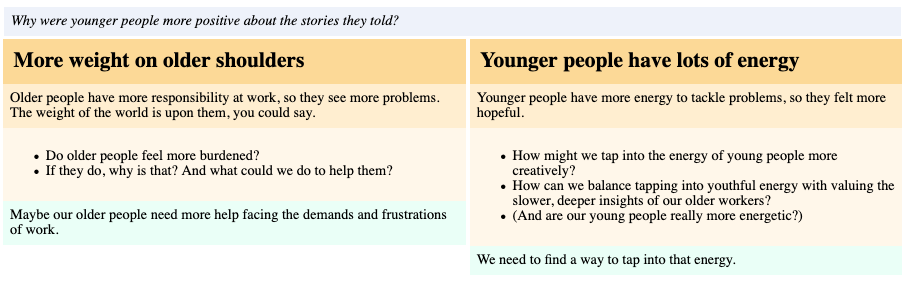
This example shows, respectively, the interpretation name, text, questions, and idea.
New report options
Many more things about the catalysis report can be controlled by the NarraFirma user, including:
- Which observation strengths to include (in any of the four types of report)
- The order of report sections (which can now be set during clustering)
- Whether to print each perspective/theme/observation/interpretation (that is, you can temporarily hide report elements)
- Whether to show sequence numbers (1, 1.2, 1.2.3) for all report elements
- More labels (for interpretation questions and ideas)
- How big graphs and graph fonts should be
- Whether to show or hide non-response (“No answer”) counts (overall and per pattern)
- Your own replacements for all graph and statistical texts (making it possible, for example, to remove all English words from reports)
Graphing improvements
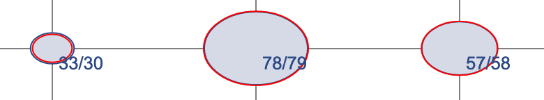
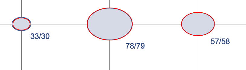
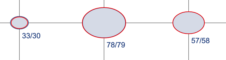
A few tweaks to the graphs make them look better. Contingency charts now show observed (and sometimes expected) counts per bubble and per row/column. This is useful in printed reports where you can’t hover over anything to see a number.
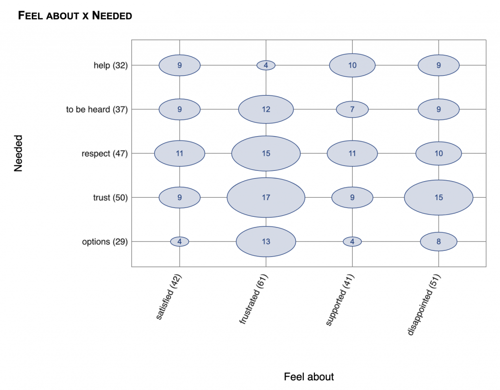
Also, the Y axis labels on contingency chart have been flipped — now they read from top to bottom, which makes more sense. And the “No answer” count is last, not first.
You can now suppress showing “No answer” counts, and you can set this option for the entire report and per pattern (for example, note the lack of “No answer” counts in the table above).
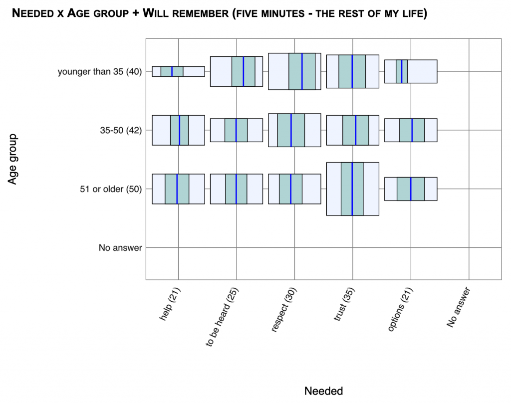
The little histograms on contingency-histogram charts are now all the same width, so they are easier to compare. The heights of the boxes show the number of stories, but the widths are all the same.
Interface improvements
A variety of interface improvements have been made. For example:
You can save any graph you are looking at to a file.
Clustering has gotten easier, with multi-select click and drag, plus more information on what you are clustering.
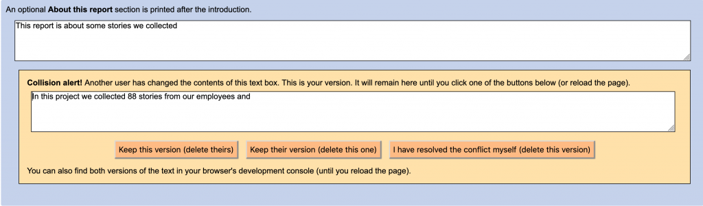
Multi-user collisions (between users editing the same text box) are now handled more gracefully.
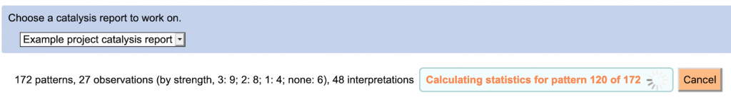
You no longer have to wait while the “Explore patterns” page calculates statistics; now that is done in the background.
Options that pertain only to printing the catalysis report have been moved to the “Print catalysis report” page. Interface texts and interactions throughout the catalysis section have been improved.
You could always write simple HTML in catalysis report fields, but now you can also use simple markup for **bold** and __italic__ text. (I added this for my own convenience, but you might like it too.)
And of course several bugs have been fixed. Most importantly, PNG graphs now draw correctly in catalysis reports, and custom CSS is now working correctly for graphs as well as texts.