This minor NarraFirma release contains several slight prettifications. All of them were occasioned by my going over all the images from NarraFirma in my new edition of Working with Stories to make sure they are clear and understandable. I didn’t like how some of the graph fonts and spacings looked in the book, so I changed the software to make them look better – for me and for you. There’s nothing like a different context to make you see things differently!
No more shouty graph titles. I changed all of the graph titles to lower case. Now they will look exactly the way you entered them. Ten years ago I thought upper-case titles made NF’s graphs look more professional. Now I think they are ugly and distorting. If you liked the upper-case titles, you can put them back. On the “Configure catalysis report” page, in the advanced options, under “Custom CSS,” add this line:
.narrafirma-graph-title { font-variant-caps: small-caps; }
Bigger label fonts. I increased the size of every font on every graph – not a lot, just a little – for better readability. You can override all of these new settings using the Custom CSS feature (but I think you won’t want to).
More no-count graph options. There has long been an option to hide the story-count numbers on contingency graphs. I’ve now added the same options for bar graphs and histograms. For histograms, you can set the option separately for single and subgraph (histogram set) versions.
Better bar-chart count label. I changed the bar-chart y-axis label from “Count” to “Number of stories.” The things in the columns of bar graphs in NF are always stories, even if the questions are about people. I think this labeling might be more clear for the people who look at your graphs. This new label also draws attention to the fact that the little alternating-color boxes on the graph are stories, which (in NF) you can hover over and read. (I think a lot of people don’t realize that.) Note that if you previously entered a catalysis-report translation for the “Count” label, and you don’t create a new translation for “Number of stories,” your graphs will still show your old translation of “Count.”
This example shows all four of the above changes (better title, bigger fonts, hidden column counts, changed y-axis label):

Bold axis names. I decided to draw all axis names (x and y) on all graphs in bold. I noticed that they were a little too easy to overlook or forget.
Better positions for subgraph names. For histogram sets and scatterplot sets, I had originally put the names of the subgraphs (e.g., Feel about: happy) in the axis labels. That never looked good to me! But I had to do it because otherwise the subgraph titles were not included in the exported PNG or SVG files (because they were outside the SVG structure). I have now fixed that, by drawing titles for subgraphs within the SVG stucture.
Boxes around subgraphs. I felt that subgraphs (in histogram sets and scatterplot sets) were easy to confuse with each other, so I put thin little boxes around subgraphs. Now, I think, it is more clear what each smaller graph shows.
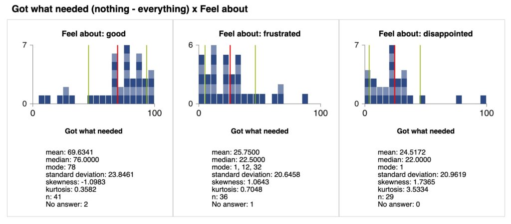
This image shows the previous three changes for histogram sets (bold axes, subgraph titles, boxes, plus no column counts):
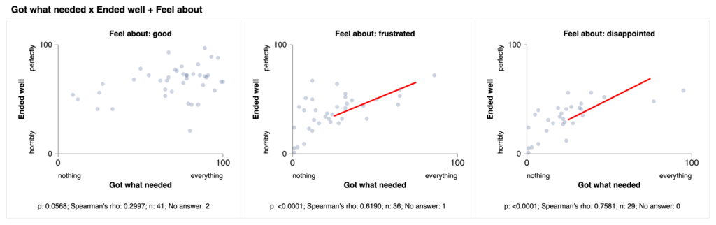
This image shows the previous three changes (bold axes, subgraph titles, boxes) for scatterplot sets:
A few other tweaks:
- On the “Configure catalysis report” page, I changed the “tables” graph type to “contingency tables.” That’s less confusing. It still says “tables” on the “Type” column in the “Explore patterns” page. That’s harder to change.
- I increased the default graph width (which drives every other size) from 800 to 900 pixels. Screens are bigger now. You can set any graph width (and height) in the advanced options, but the default is a little higher now.
Font scaling bug fixed. Lastly, I fixed a longstanding bug in the PNG file export of graphs. It’s not a fix, really. It’s just a workaround for a bug in the (very old) version of the canvg library NarraFirma uses to create PNG files from SVG (vector) graphics. The fonts on those files have always come out smaller than they should. So in this version I brute-force increased the font sizes in all PNG-exported graph images. (I had added a user-supplied “percentage modifier” to increase font sizes in reports a long time ago, but I suspect that few users have noticed it.)
The real fix for this problem will be to update the canvg library version we are using. Canvg is one of several libraries we are using in out-of-date versions from 2015 (or so). We would like to update all of them. However, updating each one will require us to update each piece of library-calling code to comply with current usages. We will also need to do a lot of regression testing to make sure we haven’t broken anything (for new or legacy projects). I hope we will eventually find the time to do it. In the meantime, NarraFirma still works fine with the old versions of the libraries, and Paul says HTML is pretty strongly backwardly compatible, so we should be fine. Probably.
As always, if you find any bugs – or find anything in NF confusing or hard to use – please tell me on the GitHub issues page.