This release contains a tiny fix to a tiny problem I had failed to solve in the 1.3.0 release but (of course) thought of a solution to the very next morning.
You want to know what it was? Okay, thanks for asking.
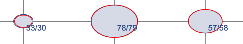
When I was drawing counts on contingency chart bubbles, and the bubbles were too small for the texts to fit into, I couldn’t figure out where to draw the texts so that (a) they could be read and (b) they would be associated with the right bubble. Without displacement they looked like this. You knew which bubble the text referred to, but it was sometimes ugly.
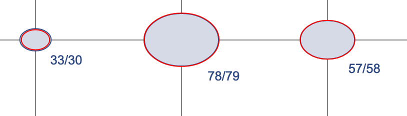
So I tried moving the texts outside the bubbles in both X and Y dimensions. But the resulting charts looked crazy, with numbers scattered all over the place, and it was not always easy to tell which text went with which bubble.
So I put out version 1.3.0 with the numbers always in the same place, but sometimes hard to read.
Then, the next morning, I realized that I should displace the texts only in the Y dimension. That way they look consistent but shift downward when they can’t fit inside the bubble.
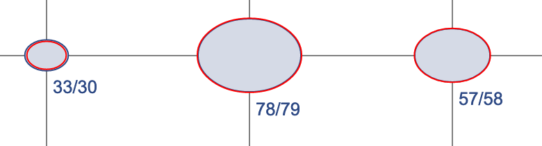
It looks a lot better now.