I (Cynthia Kurtz) am pleased to announce version 1.0.0 of NarraFirma. The software now looks better and works better. I have been working on it for about four months, adding functionality, fixing bugs, and tweaking lots of little things.
These are the main changes in NarraFirma 1.0.0 (in the order in which I happened to think of them).
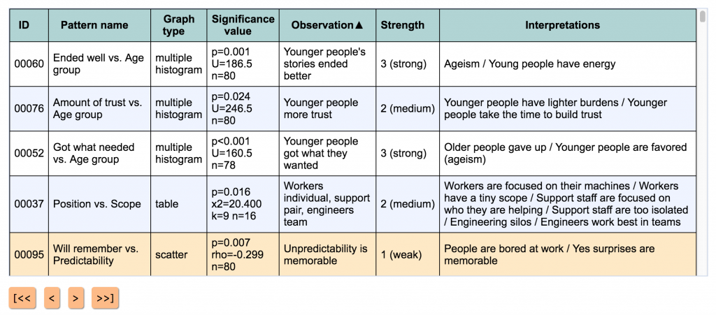
Data integrity. The “Explore Patterns” page in the Catalysis section now includes several “data integrity” graphs, which show overall trends across questions. These include:
- Values for all scale questions together in one graph (to look for systematic biases such as all answers converging to the left or middle or right)
- Means and standard deviations of scale values per participant (to look for patterns such as small ranges within participants, which might mean people were not paying much attention)
- Counts of unanswered choice and scale questions (to look for questions people avoided or didn’t understand)
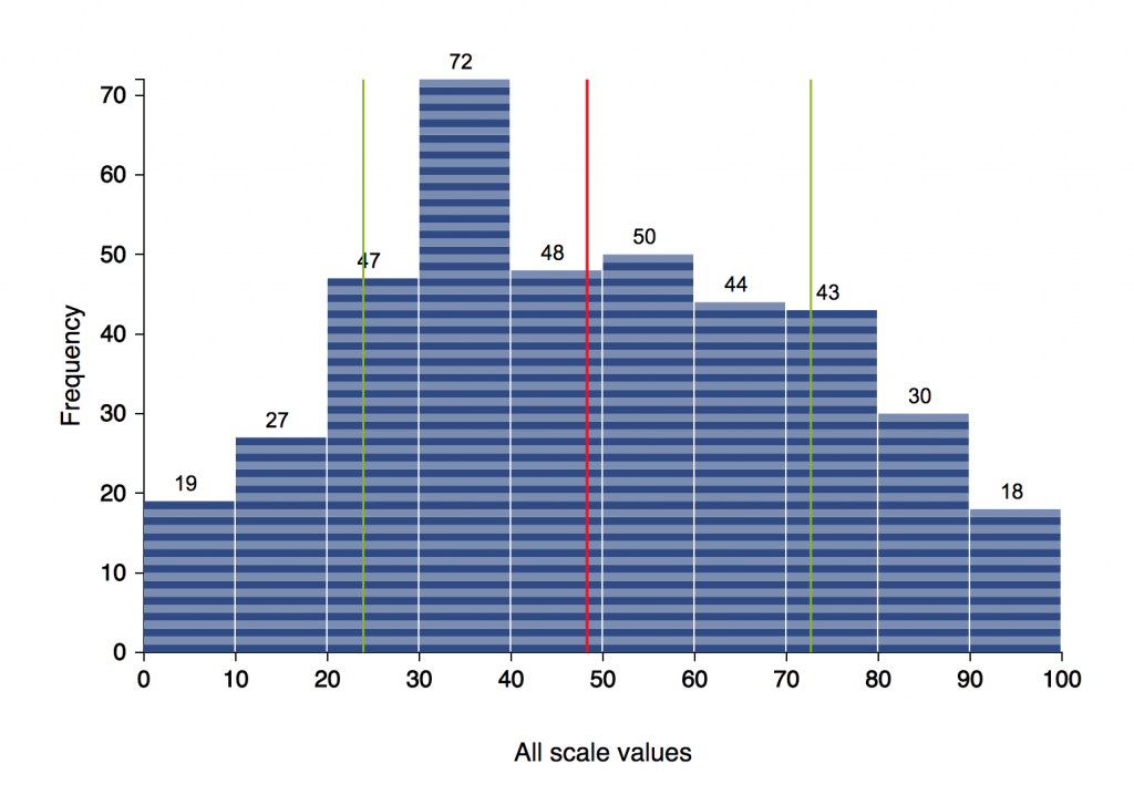
These new graphs are listed on the “Explore Patterns” page, so you can write observations about them and include them in your catalysis report. (Also note that bar graphs and histograms now have number labels above each bar.)
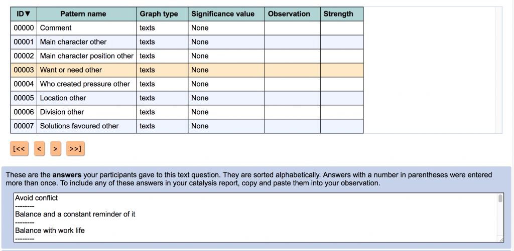
Qualitative observations. The answers to free-text questions are now included in the “Explore Patterns” page. You can look at all the answers in one place (sorted alphabetically, with duplicates marked), and you can write observations and interpretations based on them.
You do have to copy and paste texts into your observations. This may seem like a cop-out, but I did it on purpose. I played with different options for creating observations based on text answers, such as clicking on check boxes, reviewing texts in tables, and so on. In the end I decided that simple copy and paste gives users the most flexibility. You might want to include only part of what somebody wrote, or you might want to embed what somebody wrote in your own explanatory text about it. This option shows you what people wrote and gives you the ability to review it and use what you need from it. That’s all you need.
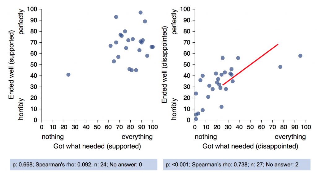
Multiple scatterplots. The “Explore Patterns” page now includes scale+scale+choice question combinations. This was something we had on the list to do in the earlier version but ran out of time for.
A few other things to note with respect to these graphs:
- Scatterplots can now (optionally) show correlation lines.
- Statistical displays have been made both smaller and more informative. For example, all graphs now show the count of stories on which the question was not answered.
- Because this scale+scale+choice addition means there could now be hundreds of scatterplots generated, I added a progress bar (with cancel button) when more than 200 statistical results are being generated for the patterns table. This prevents people having to look at a blank screen while the page calculates its content.
Custom CSS. You can now style the HTML content of your survey (on-line and printed), story cards, and catalysis report. Nearly every element of these generated pages has a class whose style you can change.
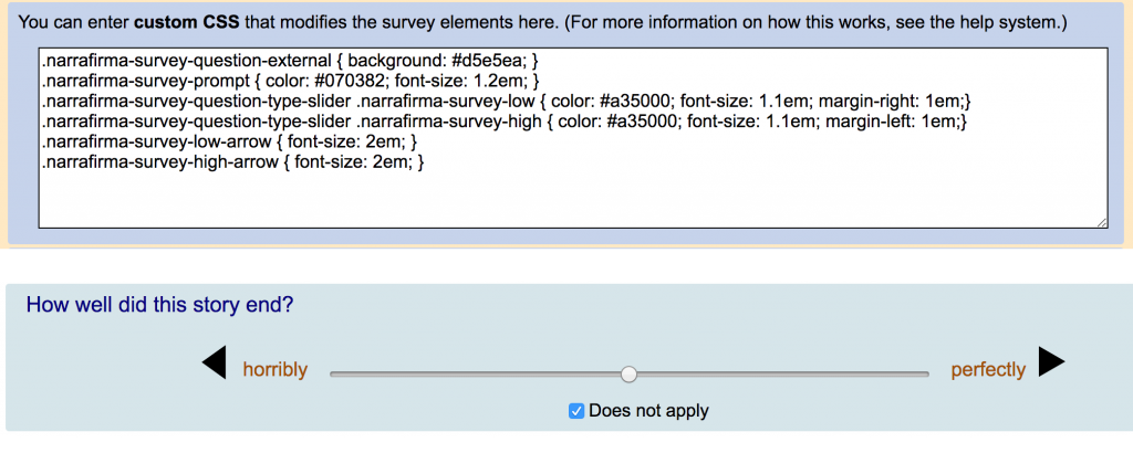
NarraFirma’s survey system is still far less sophisticated than that of most surveying packages (there is still no built-in “other” field for choice questions, and no question piping), but at least now you can make your survey page look a lot better. Also note that in the survey itself, users can now see the numerical value of each slider as they drag the button (though if you don’t like this you can use CSS to hide the new number value). They can also click on the number to change it in a popup dialog. I also made the survey image field function (it was an oversight that this field never worked).
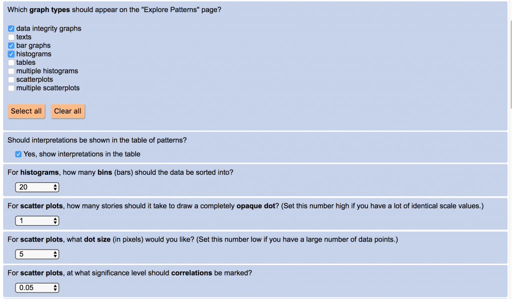
More catalysis options. There are now more options for drawing graphs and for building a catalysis report, including:
- choosing which graph types to see at any time (a big plus for times when thousands of graphs can be generated)
- setting dot size, opacity, and correlation lines on scatter plots; numbers of bins on histograms (these choices are especially useful if you imported your data from elsewhere)
- showing interpretations in the patterns list (for times when you wrote an interpretation but can’t remember what observation it was attached to)
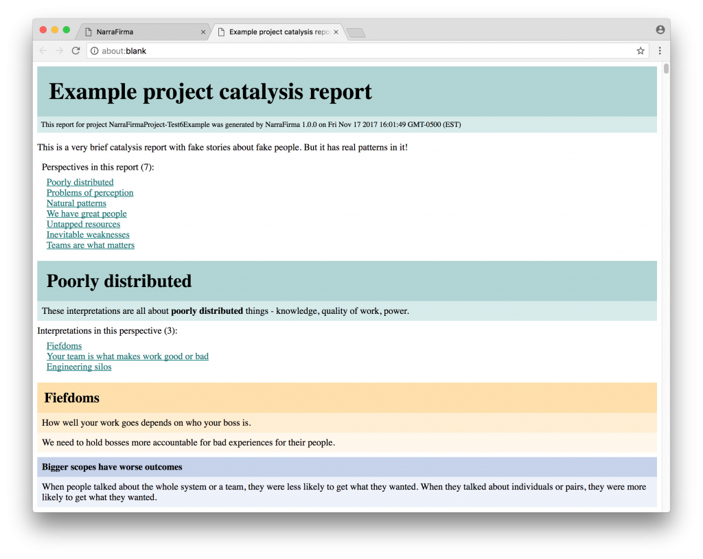
- more user-supplied sections in the catalysis report: introduction, “about this report”, table-of-contents headers, labels for report parts, conclusion, custom CSS
- better support for HTML in texts for observations, interpretations, perspectives, and ideas (and ideas now print in the report)
- the default catalysis report (without writing any custom CSS) now looks a lot better (I think)
Please note: If you have a catalysis report created with a version of NarraFirma prior to version 1.0.0, and it contains interpretations with ideas in them, the ideas will not print with your catalysis report in NF >= 1.0.0 until you go to the “Cluster interpretations” page and click “Start or update clustering diagram.” (This is the only backward incompatibility issue in this version release. Few people should be affected by it, and it’s easily fixed.)
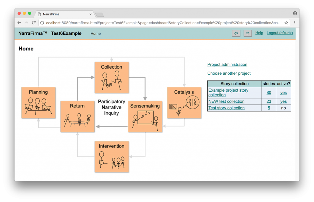
Improved colors. NarraFirma’s color scheme has been improved and simplified. (I don’t know about you, but I gradually lost my patience with the color of green I thought was energetic two years ago. These new colors are more subdued, possibly more professional, and at very least less irritating.) I also replaced the home page “PNI diagram” image map with something that I think is easier to understand. I removed the most annoying parts of the visual look of NarraFirma (at least to me) – the diagram triangle, the blue gradients, the rounded rectangles. I think the software looks more confident and “grown up” now. (Hopefully you do too.) Also notice the new “Choose another project” link, which means you can switch projects without logging out.
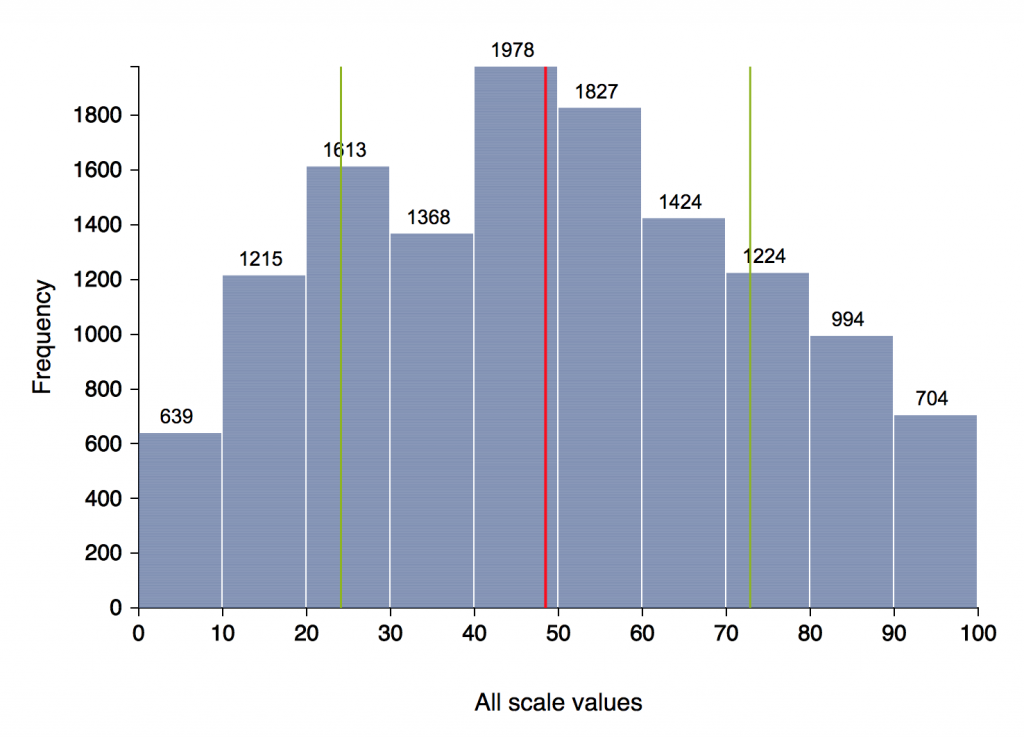
More testing. I spent several weeks on additional testing, in two ways. First, I created some new fake projects and ran through them, looking for problems to pop up (and they did, and I fixed them). Second, I converted and imported data from several old projects. In these I compared NarraFirma’s graphs and statistics to those generated using other software (and fixed more little bugs). Here is an example of a large (pre-NarraFirma) data set I imported for stress testing.
Note that I also tested several data sets created or imported within the past two years, and I can report that your updated copy of NarraFirma should not have any problems reading data you created in it (or imported into it) within the past two years. I did add some new fields, but they are optional and have defaults. No existing data formats have been changed. (The one exception, ideas on clustered interpretations, is explained above.)
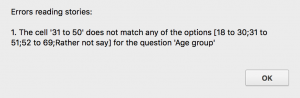
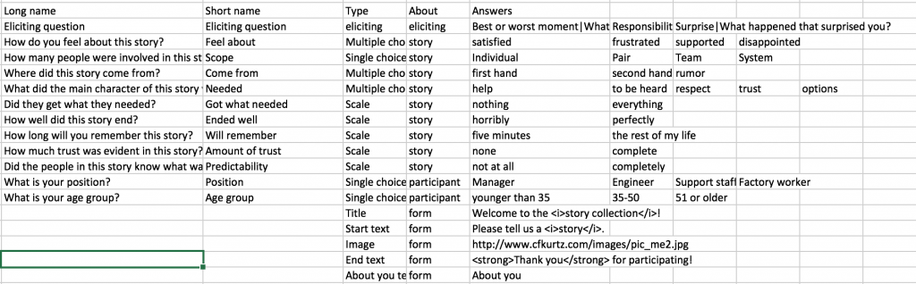
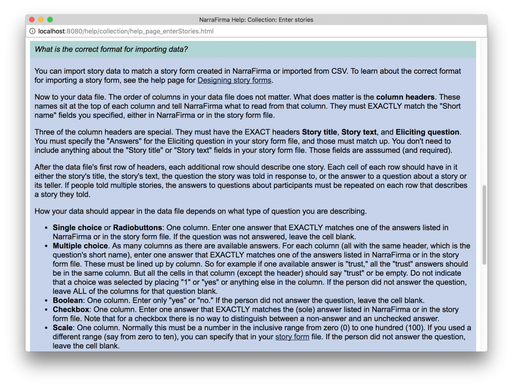
Better importing. While importing old data sets I gave the data import function a good workout. As a result I added more import options, better error checking and reporting, and a much better explanation of how the import system works. Shown here are an example error report, a CSV story form with new “form” options, and (the start of) one of the import help pages.
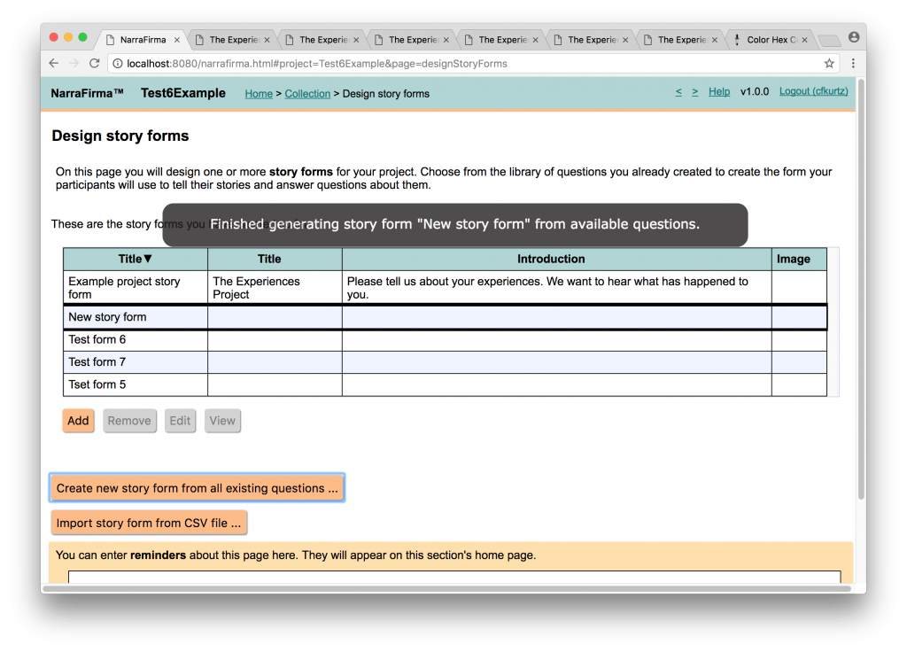
Auto-created story forms. One of the irritating things about building a story form in NarraFirma was that you had to write your questions, then place them one by one into a story form. I’d had about enough of that, so I added a button that generates a new form based on the questions you’ve written.
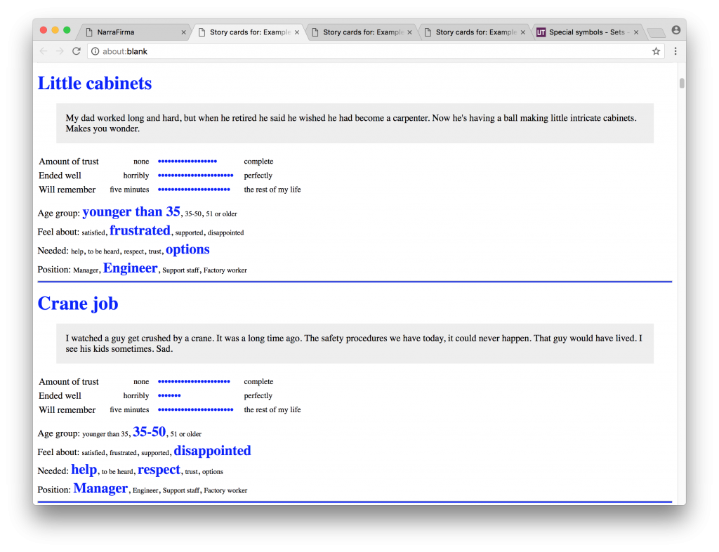
Better story cards. You can now choose which questions to include on your story cards. You can also customize how ranges are drawn and control all aspects of the cards with custom CSS. In this example I used color and spacing to create cards on which differences will stand out from further away. This can be helpful during a sensemaking session.
Observation strengths. You can now set a strength value on each observation as you write it and use these to sort your observations. This will be a big help during the stage of catalysis when you stop looking at every pattern and start whittling down your observations to what you have time to explore in detail.
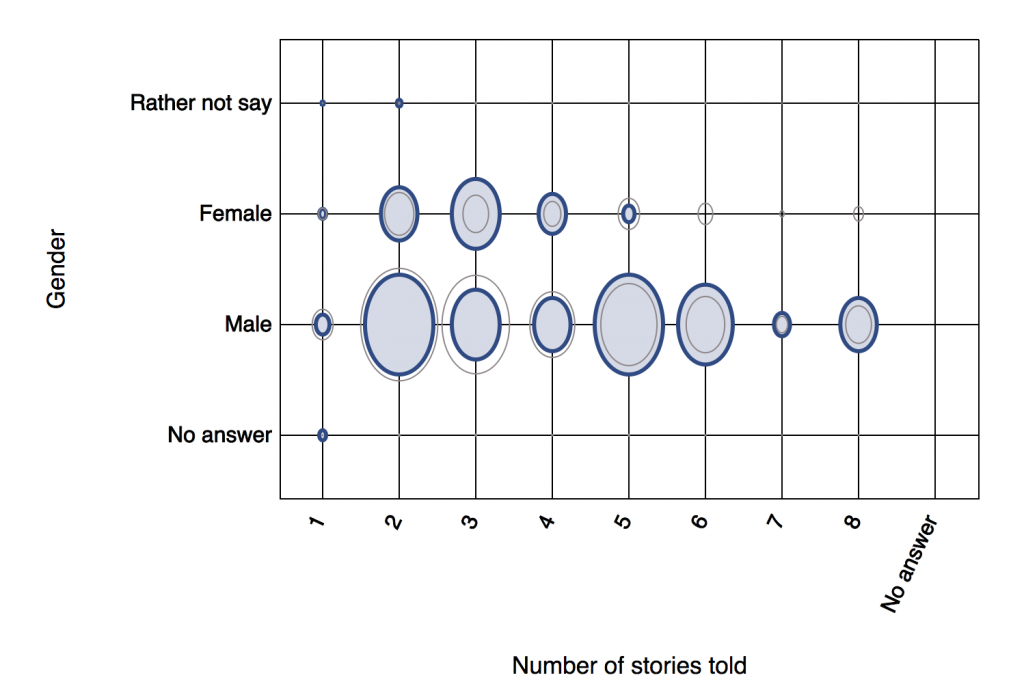
Number of stories told. There is now an auto-generated field in each story collection that counts how many stories each participant told.
- In a NarraFirma web survey (or data entry form), this depends on people clicking the “Yes, I’d like to tell another story” button (so the count is how many stories people told per session, not necessarily per individual).
- In an imported file, the column titled “Participant ID” determines how stories are grouped by participant.
In either case, the story count per person is handled as though it was a question, and NarraFirma generates graphs showing it in relation to other questions. If everyone told one story, you can ignore this generated question. However, in cases where people had the option of telling any number of stories, you can sometimes see useful patterns in how voluble people wanted to be.
I considered doing the same thing with story length, but decided not to, for two reasons. First, I’ve looked at story length on several projects and have never found any useful patterns in it. Whether somebody talks or writes for longer doesn’t seem to mean much. Second, it’s impossible to set categories for story length when all the stories haven’t yet been collected, and I didn’t want to introduce a graph whose meaning kept changing. Besides, if anyone really wants to look at story length, they can use the annotation system to add such a question and fill in the values by hand.
Side note: I found a bug in the chi-squared statistical test which was leading to too few test results being shown (and too many “count below threshold” messages showing instead). You will see more p-values in your “table” graphs now.
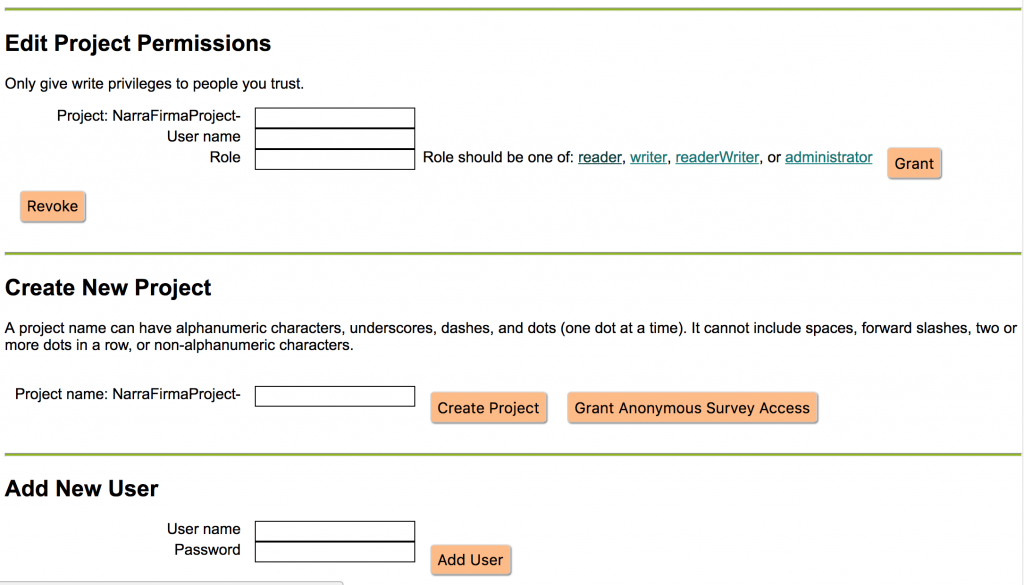
Better admin page. I cleaned up the way-too-nerdy page for creating projects and users in the node.js version. (The WordPress version admin page is unchanged.)
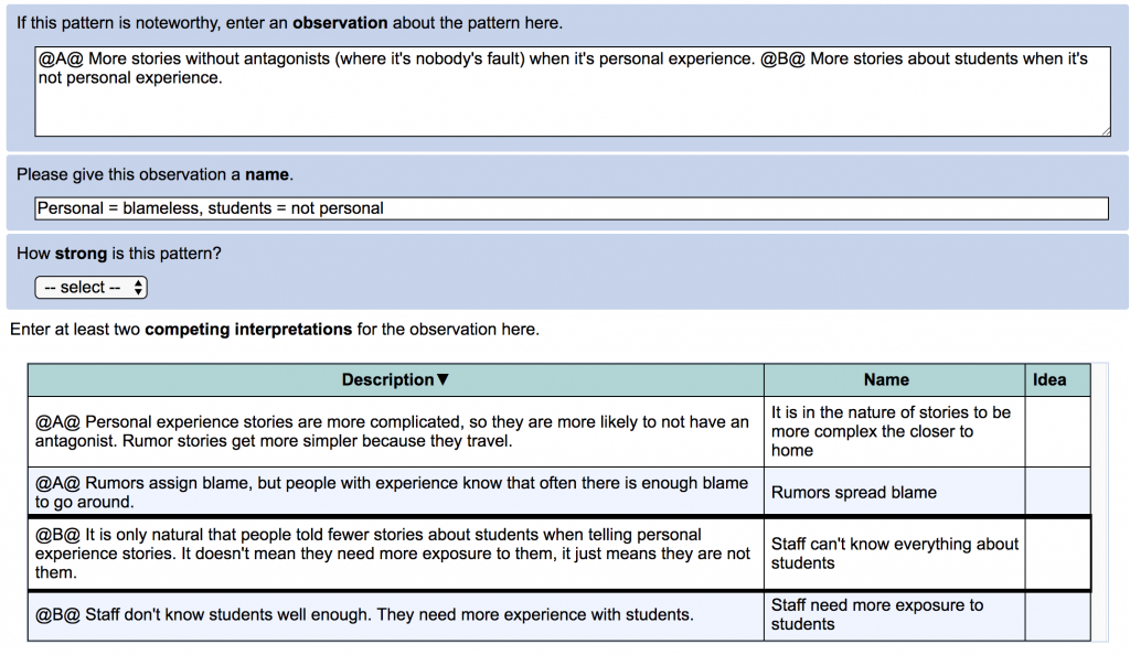
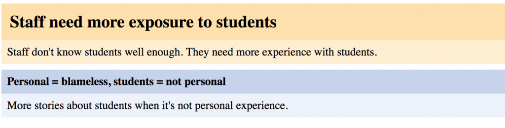
Observation sections. A user asked about adding the ability to write more than one observation per graph. I didn’t want to clutter up the most complicated page in the application even more, so instead I added a function that is hidden from view. If you segment an observation using tags such as @first@ and @second@, you can then refer to those sections in your interpretations. In your report, the observation under each interpretation will show only the section of the observation you referred to.
I also fixed a bug where changes to interpretations made after the clustering diagram was created did not appear in the printed catalysis report.
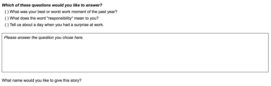
Fully configurable survey fields. You can now enter your own texts for every part of your story form. There are no longer any hard-coded texts, like “Please enter your story here.”
That’s it. There were also many little bug fixes and tweaks to how things look. We hope this new version will be even more useful than the last. Please send feedback and ideas.
Last thing: If you have an existing NarraFirma installation and need help upgrading it to the new version, check our installation page for instructions.