This minor NarraFirma release adds two things: more noticeable warnings when you have read-only access to a project; and a bit more information on the “spot-check graphs” page.
More noticeable read-only warnings
A helpful NF user told me that they sometimes forget to log in, type in some texts, and then lose their changes when they reload the page. To help people avoid this difficulty, I have made the situation in which you have read-only access to a project more obvious.
- The warning message that pops up when you first enter such a project (or reload a page) now displays for 8 seconds instead of 5, so you might be more likely to notice it.
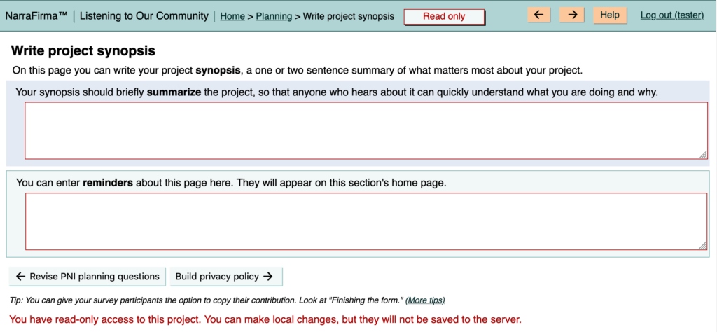
- The read-only label at the top of the page, which was tucked away in the upper-right corner, is now front and center, in a box with a border. It should be harder to miss now.
- There is now a read-only text reminder at the bottom of each page as well.
- In read-only mode, each text box and drop-down list now has a red border.

These graphical changes should make it more obvious that your edits are not being saved to the server.
Why can you edit a NF project locally in read-only mode? Because we thought people might want to make tentative local changes, save their altered project as a file, and use it to propose permanent changes to a team project.
Apparently nobody actually does this. So we could remove this functionality and make it impossible to edit anything at all when you are viewing a project in read-only mode. However, that’s not a change I want to make lightly, because it could break things. So if we change this, we will take the time to do it carefully. For now, these improved warnings should be enough to help.
More info while spot-checking graphs
Another helpful tip (from the same user) was that the “spot-check graphs” page makes a sort-of-okay dashboard to use with participants in sensemaking. I had never thought of using it that way!
I have been thinking about adding a participant dashboard to NF for years, but have not yet got around to building one. If you have any ideas on what such a dashboard should do or look like, please send them to me (cfkurtz at cfkurtz dot com).
Anyway, while I was fixing the read-only issue, which seemed important enough to address right away (and I had a moment to spare between other things), I took another moment to enhance the spot-check graphs page a bit. Specifically:
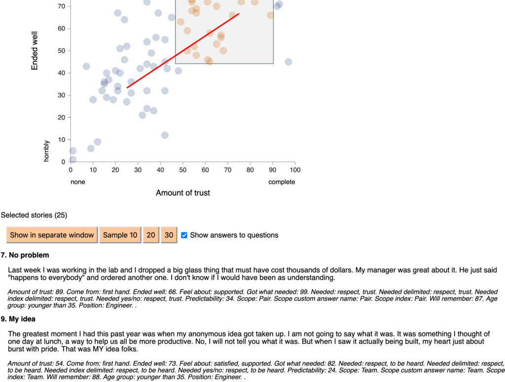
- You can view the stories you have selected in a separate window for copying and pasting elsewhere. (You could of course copy and paste from the HTML page already, but this is a bit easier.)
- You can view a random sample of 10, 20, or 30 of the selected stories. This is useful when your list of selected stories is long and you don’t want to choose a biased subset. (In a dashboard, you should also be able to filter stories by answers to an additional question.)
- You can view a bare-bones description of the answers to questions about the selected stories. It’s not as nice a presentation as in the story cards, but it’s still useful, especially if you paste it into a word processor.

You might wonder why there is no copy-to-clipboard button in the “Show stories in separate window” window. It’s because the way you copy to the clipboard is different in different browsers and operating systems (and between WordPress and Node.js). Rather than try and fail to make a universal copy-to-clipboard button work, I decided to rely on the fact that everybody knows how to “select all” and “copy to clipboard” in whatever environment they use. I can do that so fast I don’t even notice I’ve done it, and probably you can too.
A big thank you to the user who proposed both of these changes! And as always, if you find any bugs, please tell me on the GitHub issues page.