This minor release is an anti-verbosity pro-clarity update. I looked around NF for “chartjunk” and annoying distractions and removed as many as I could. This is easiest to do when I haven’t used NF for a while and am able to get some distance from it. When I can look at it with fresh eyes, improvements don’t feel (as much) like picking at my own flesh.
Easier data editing
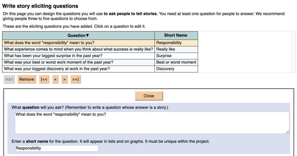
I finally got rid of the two-mode view-edit display system when you click on a thing (like a question or a story) in a table of similar things. Our original plan was that a two-step system would help people avoid accidentally ruining their data. We thought people should have to view each item, then click “Edit” to change it. But in truth, that extra step is just annoying. As I watched people use the list-of-things widget, I realized that it didn’t really help people protect their data. It just confused them for a while, and then they learned to skip over the view-only step.
So it is gone, man. I removed the “View” and “Edit” buttons. Everything is editable all of the time. Have at it.

Help remembering to give things names
Several items in NarraFirma require short names that identify them:
- questions (eliciting, about stories, about participants, annotation)
- story forms
- story collections
- catalysis reports
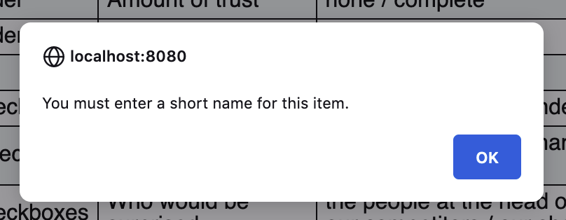
Some users have had problems because they created things without giving them short names. This caused problems in linking the things up to other things. NF no longer allows you to do this.

I have also tried to make it more clear that short names are required for some items, in words and in colors.

You can still create a no-name item if you stop editing the short-name field by going to another NF page (for example, by clicking one of the arrow buttons at the top of the page). However, if you stop editing the field by:
- clicking the Close button
- clicking on another item in the list
- clicking one of the arrow navigation buttons under the list
NF will check to see if you set a short name and remind you if you didn’t. That should help. My suggestion is: don’t use the “next page” and “previous page” buttons at the top (or bottom) of the page unless you are done working on that page.
In retrospect, every item in NF should have had UUID linkups rather than short-name linkups. I could change this, carefully, in the future. I just don’t have the time to do it (carefully enough) right now.
I also changed the lists-of-things widget so that it only shows the previous and next arrows if you have 2 or more items in the list, and the start and end arrows if you have 6 or more items in the list. Useless buttons are annoying.
Better story-form editing
When you are creating a story form and rearranging your questions in it, it’s hard (and annoying) to remember what short name goes with what question text. Now it says the question text right there.

Button icons!
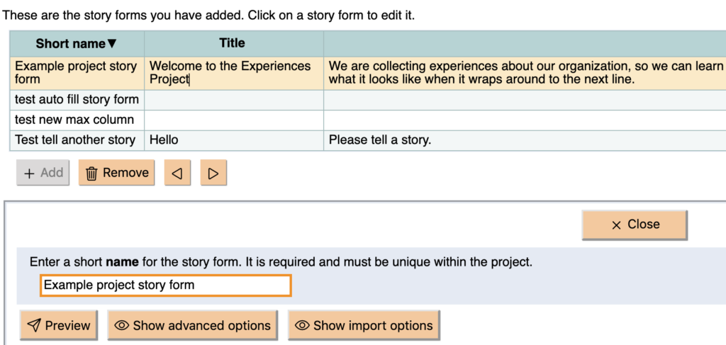
Finally, I went through NF and added an icon for every button. Button icons can be cluttery! And annoying! But if they are consistent, they can improve clarity and speed up comprehension, smoothing your workflow. Hopefully these new icons will be of the improving and speeding type, and not the annoying type.

There are a few places where I did not add button icons. These are places where there are several buttons in a set. Adding icons to each of those buttons would take up a lot of screen space. So I left those alone.
![]()
Otherwise, every button in NF now has an icon. (Well, except for a few “Close” buttons on pop-up dialogs.)
Little things
I also made some smaller clarity improvements:
- I simplified the header at the top of every page.
- I cleaned up the section pages (Planning, Collection, etc), removing every extraneous word I could find. I shortened the headings and the page-link explanations. Now the section pages should be more quickly skimmable.
- In Planning, I moved the “Assess story sharing” page closer to other pages related to assessment.
- In Collection, I renamed the “Design, generate, or import story forms” page to the simpler “Build story forms.”
- I changed the Help link (at the top of the page) to a Help button so it’s harder to miss.
- I removed the orange backgrounds from the section-page headers so they look calmer and less like buttons.
- I changed the colors of the navigation buttons at the bottoms of the pages. I always felt like they distracted the eye from the content of the page. Now they are more parenthetical.
- I fixed a bug in which activity lists in printed sessions (for story collection and sensemaking) were not in the correct order.
As always, if you find any bugs – or if anything about NF is unclear or annoys you! – please tell me on the GitHub issues page.